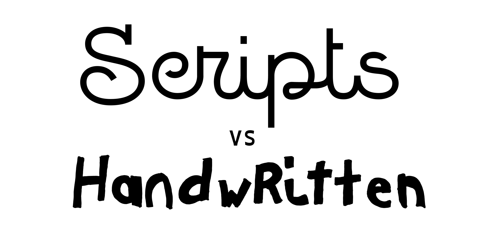
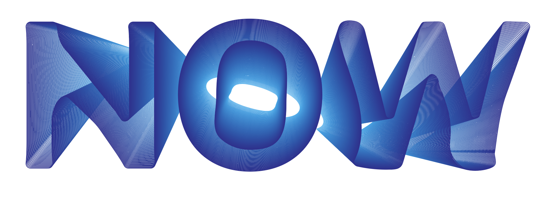
IDSA Typography Workshop
What we’ll be covering:
1 - Finding Inspiration
2 - Resources (where to find fonts)
3 - Installing
4 - Brief History
5 - Categories of Type
6 - Principles
7 - Choosing
8 - Editing
9 - Effects
Finding Inspiration
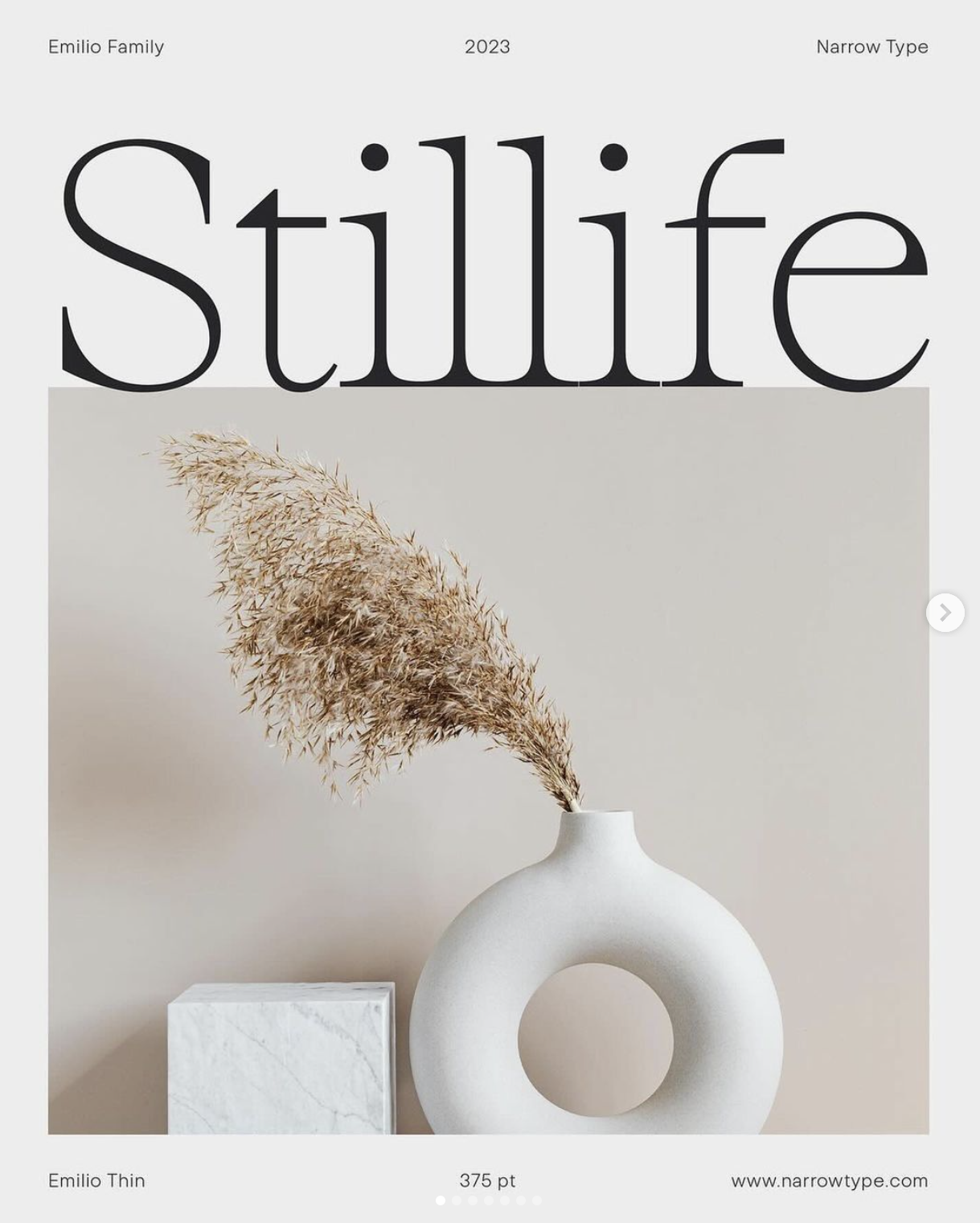
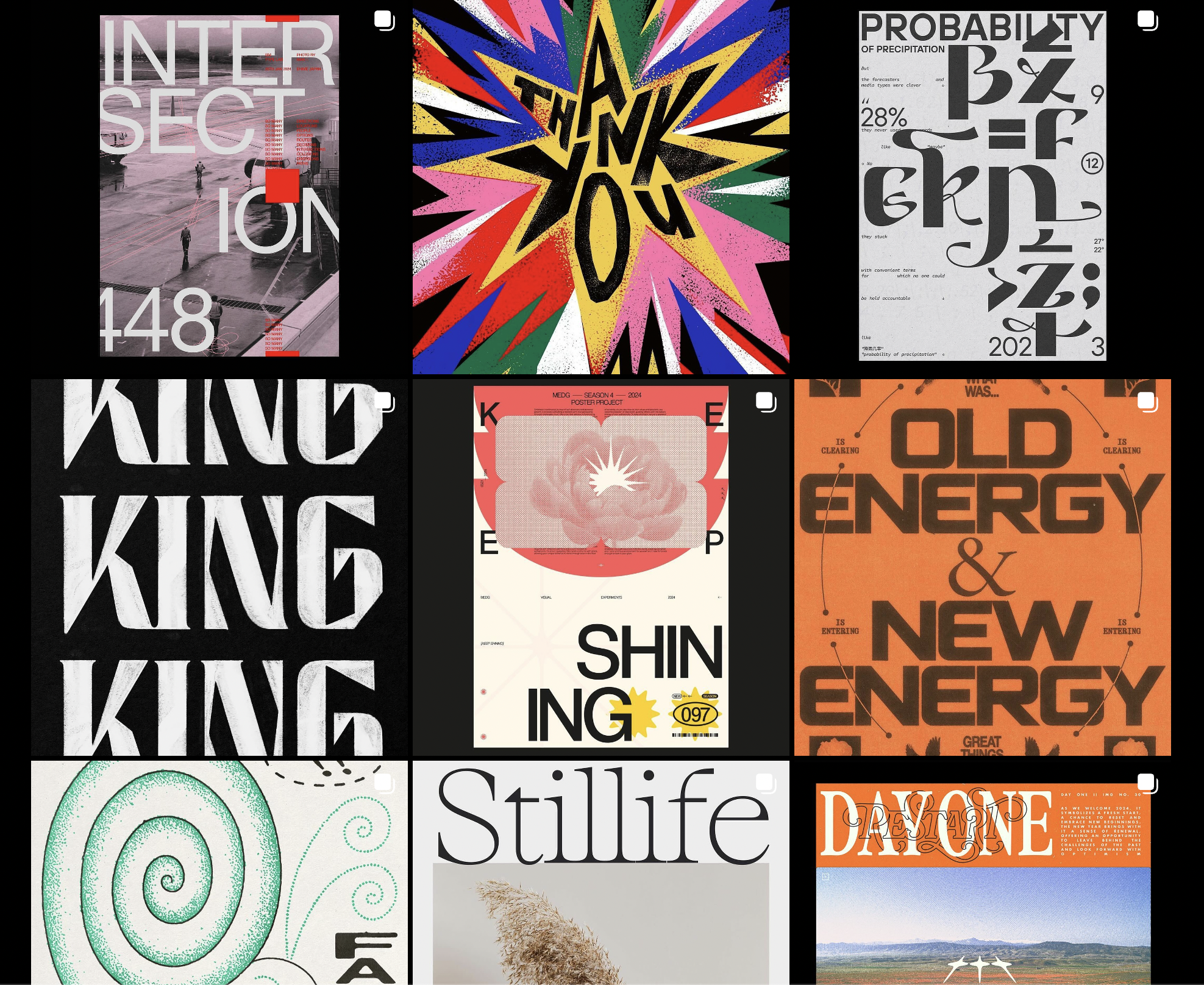
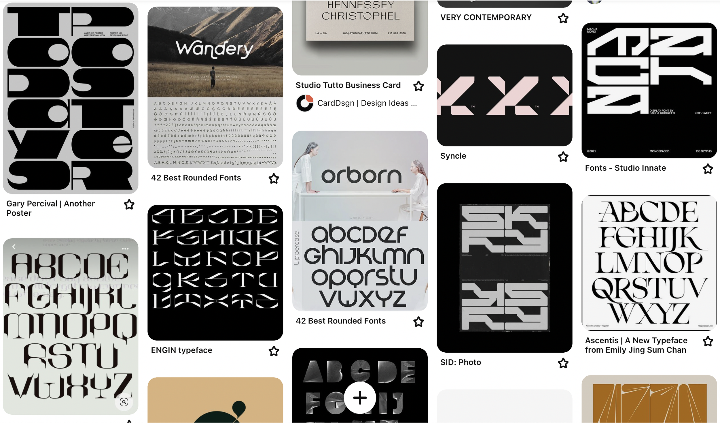
Instagram and Pinterest are great sources of inspiration as always. I would HIGHLY recommend starting a folder or board to save stuff that you like for future reference when doing graphic design related tasks.
My folders and boards for example. Feel free to use as reference or starting place for making your own
Some instagram accounts I like for this are:
ruido.98
Resources
Where to find free fonts?
Dafont - Easy to browse thousands of free fonts, hit or miss, but you will eventually find what you’re looking for. My go-to.
Fontspace - Good selection, great search filtration. lots of cheesy fonts to sift through.
Fontpair - Free, currations of fonts that pair well together. Great inspiration, don’t have to scurry through much garbage.
Fontspring - Great for inspiration and seeing what the professional world is doing. Horrible for your wallet.
Paid Sites
Holy $#*%! what are they smoking?!?!
it’s unbelievably expensive.
Google Fonts - Good selection, clunky site, not great at finding what you want.
Adobe Fonts - Fast to integrate stuff into Adobe programs, otherwise not great for finding what you want.
Fontfabric - They design custom fonts for brands and for sale. Also great inspo, sad wallet time.
Installing Typefaces
Mac OS
Download the Font: Find the font file you want to install. Fonts often come in .ttf, .otf, or .dfont formats.
Open Font Book: Font Book is the default font management app on macOS. You can find it by searching in Spotlight or by navigating to Applications > Font Book.
Install the Font: Double-click on the font file you downloaded. This action will open the font preview in Font Book. Click the "Install Font" button in the preview window.
Confirmation: Font Book will confirm that the font has been installed by displaying a message. The font is now ready to use in Adobe applications or any other text editing software on your Mac.
Windows OS
Download the Font: Find the font file you want to install. Fonts typically come in .ttf or .otf formats.
Open the Font File: Double-click on the font file you downloaded. This will open a preview window showing the font.
Click “Install”: In the preview window, click the "Install" button at the top left. Alternatively, right-click on the font file and select "Install" from the context menu.
Confirmation: Windows will confirm that the font has been installed with a pop-up message. The font is now ready to use in Adobe applications, or any other text editing software on your Windows device.
Note: If installing multiple font families at the same time, it is preferable to open the Font Book (mac) or Font Folder (Windows) and drag the fonts you want installed into there, rather than installing all of them one by one.
Brief History
The incredible story of the world of fonts, some famous typefaces to know.
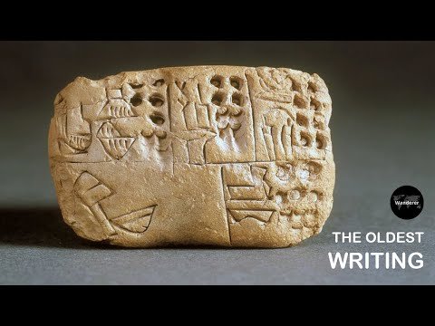
The Kish Tablet and Proto-Cuneiform
limestone tablet with pictographs and markings that date back to around 3500 BCE. The tablet was found at the site of the ancient Sumerian city of Kish in Iraq
The oldest known writing system is cuneiform, which originated in Mesopotamia
around 3400 BC. The word "cuneiform" comes from the Latin word cuneus, which means "wedge".
Pictographic, Ideographic, and Alphabetic Languages:
Pictographic - use simple pictures or symbols to represent objects or ideas directly.
Ideographic - use symbols to represent abstract ideas or concepts rather than specific objects, though some symbols may have originated as pictograms. (Chinese, Japanese, and Korean)
Alphabet - Each letter typically represents one or more sounds, known as phonemes. Much easier to teach and learn compared to the previous types.
Phoenician alphabet, which emerged around 1050 BCE. The Phoenician alphabet consisted of 22 consonantal letters and is considered the ancestor of many modern alphabets, including the Greek, Latin, and Cyrillic scripts.
Gutenberg and the Printing Press (15th Century):
Johannes Gutenberg's invention of the movable type printing press in the mid-15th century revolutionized the production of books and printed materials.
The Gutenberg Bible, printed around 1455, is one of the earliest and most famous examples of printed material using movable type.
Blackletter Typeface (15th Century):
Also known as Gothic script, Blackletter was a dominant style in European printing from the 12th to the 17th century.
Famous landmarks include the "Gutenberg Bible" and the "Thirty-Six-Line Bible" printed by Johannes Gutenberg, both of which utilized Blackletter typefaces.
Roman Typefaces and the Renaissance (15th - 16th Century):
In the 15th century, humanist scholars sought to revive the classical Roman letterforms of antiquity.
Aldus Manutius, a Venetian printer, is credited with popularizing the use of the italic typeface in the early 16th century, which was designed to mimic the handwriting of the time.
EB Garamond Typeface (Late 16th/20th Century):
EB Garamond is a digital revival of the Garamond typeface, which was originally created by Claude Garamond in the 16th century.
The digital revival was initiated by the Egenolff-Berner foundry (hence "EB" Garamond) in the late 20th century, aiming to recreate the elegance and historical accuracy of the original Garamond typeface.
EB Garamond is praised for its readability and classical aesthetic, making it a popular choice for both print and digital typography.
Helvetica Typeface (20th Century):
Developed in the 1950s by Swiss typeface designer Max Miedinger with Eduard Hoffmann, Helvetica is one of the most iconic and widely used sans-serif typefaces.
Its clean, neutral design makes it versatile and suitable for various applications, from signage to corporate branding.
Helvetica became a landmark in modern typography and is still prevalent in design today.
Categories of Type
4. Display: Display typefaces are designed for use at larger sizes, such as headlines and titles. They often feature unique and eye-catching designs, making them suitable for grabbing attention and creating a visual impact. Examples include Impact and Cooper Black.
5. Monospaced: Monospaced typefaces have characters that each occupy the same amount of horizontal space. They are commonly used in coding, where alignment and readability are important. Examples include Courier and Consolas.
1. Serif: Serif typefaces are characterized by small lines or strokes (serifs) attached to the ends of the strokes that make up the letters. These typefaces are often considered more traditional and are commonly used in printed materials like books and newspapers. Examples include Times New Roman and Georgia.
2. Sans-serif: Sans-serif typefaces lack these small lines or strokes, giving them a cleaner and more modern appearance. They are often used for digital content and display purposes due to their readability on screens. Examples include Arial, Helvetica, and Roboto.
3. Handwritten/Script: Script typefaces mimic handwriting or calligraphy styles, with flowing and often decorative letterforms. They are commonly used for invitations, branding, and other decorative purposes. Examples include Brush Script and Lucida Calligraphy.
Principles & Lingo
Kerning:
Kerning is simply the space between the letters. Also known as “keming”.
Bad Examples:
Good Examples:
Tracking:
Leading:
Heirarchy
Establishing a clear visual hierarchy helps readers understand the relative importance of different elements in a design. This is achieved through variations in font size, weight, color, and spacing.
Vocabulary to Know
1. Style and Design Language Compatibility: The font style should align with the design language of the project. For example, if the project has a modern and sleek design, sans-serif fonts with clean lines and minimalistic aesthetics might be appropriate. If the design leans towards a more traditional or ornate style, serif fonts with decorative elements could be suitable.
Choosing the Right Typeface
Choosing the right font for your poster can greatly enhance its impact and convey your message more effectively. Experiment with different fonts, sizes, and styles to find the combination that best compliments your design and captures the attention of your audience. Here’s 5 tips for font choices.
2. Legibility and Readability: Legibility is crucial for conveying information effectively on a poster. Ensure the chosen font is easy to read from a distance and in various lighting conditions. Avoid overly decorative or intricate fonts that may sacrifice readability. Additionally, consider the size of the text and its placement within the poster layout to optimize readability.
3. Emotional Impact and Tone: Fonts convey subtle emotional cues and set the tone for the message being communicated. Consider the intended emotional impact of the project and choose a font that reflects or enhances it. For instance, clean and minimalist fonts can convey professionalism and efficiency, while bold and expressive fonts can evoke excitement or creativity.
4. Consistency and Cohesion: Ensure that the chosen font aligns with the design language across the project. From project style, to colorscheme, to graphic design principles, to fonts; each one of these can be carefully chosen to make your project stronger.
5. Balance with Visual Elements: The font should complement the visual elements of the poster, such as images, graphics, and layout. Pay attention to factors such as contrast, spacing, and hierarchy to create a harmonious composition. Experiment with different font weights, styles, and sizes to find the right balance between text and visuals.
Editing Fonts - Illustrator
Editing with the Direct Selection Tool
Ctrl/Cmd + Shift + O - Make a font into editable anchor points,
tip - select everything and smooth corners
Custom Shapes with the Pencil Tool
Click on the line/shape you want to alter, use the pencil tool to draw the new shape
tip - use the smooth tool on your pencil ilnes
Bending with the Curvature Tool
Click on the line/shape you want to alter, use the curvature tool to make new anchor points, drag to desired shape
Instagram Tutorial:
1. Add a stroke to your text and outline it.
2. Copy text and paste the copy in the behind original.
2. Select both, Object -> Blend -> Blend Options…
3.
4. Double click to select the back object only and transform and rotate 45 degrees.
