Rethinking the Denver Zoo Website Experience: A UX/UI Case Study

Your Role
I was the only designer and researcher on this project. From start to finish, I was responsible for user research, competitive analysis, and designing all the wireframes and prototypes.
Challenge
The Denver Zoo’s website was outdated, confusing to navigate, and the process to buy tickets was lengthy. I had limited time and resources, so I focused on key pain points that would have the biggest impact.
Summary
This project focused on redesigning the Denver Zoo website to improve usability, navigation, and overall visitor experience. It was important to address the challenges users face while planning their visits, such as purchasing tickets efficiently. The end result was a more intuitive design that helps visitors connect with the zoo before they even step through the gates. Try out the final results here.


Research
Usability Testing of Current Experience
I tested the current website with five users to figure out where people were getting stuck. The biggest issues were a frustrating ticket-buying process, hard-to-find maps, and a lack of clear info on events. On the bright side, this showed me where I could focus improvements, like simplifying navigation and making the site more visually appealing.
Competitive Analysis
I also looked at other zoo websites (like the San Diego Zoo and Smithsonian National Zoo) to see what they were doing well. This gave me some ideas and led to “How might we” questions like:
How might we create a ticket purchasing experience that reduces confusion and increases user confidence?
How might we optimize the purchasing experience to use fewer screens and clicks?
How might we provide early and transparent pricing information to help users make informed decisions quickly?
Design
Problem statement
“Visitors aged 16-64 need a streamlined way to buy tickets across ages, dates, and add-ons because life is hectic, and people should have a hassle-free, nearly thoughtless experience when purchasing tickets.”
User flow
Firstly, I found related tasks and categorized them, then put them in an order that made the most sense. By combining related tasks into single pages instead of one-page-per-task, the ticket buying task flow shortened from 11 pages to 7.
Medium fidelity wireframes
When moving into a digital screen space, your decisions are quantized, this helped establish a better sense of hierarchy, timing, and functionality.


High fidelity prototype
The last prototype was all about the details. It included a more polished design, colors, and the ability to click through to view all the pages in the task flow. You can see the mock-up here.

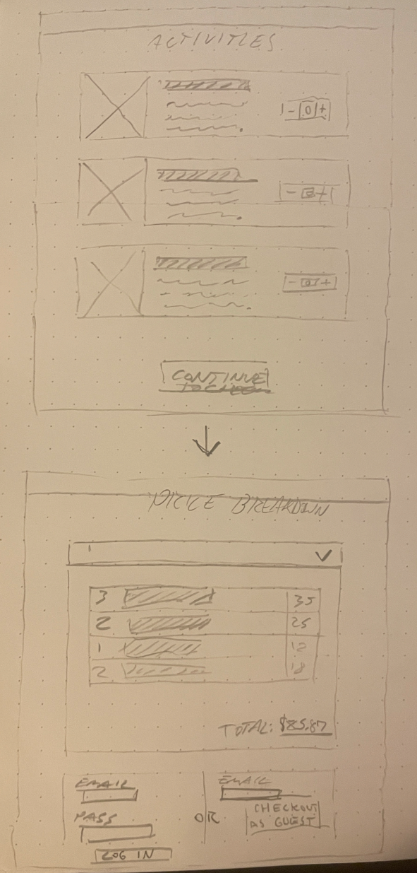
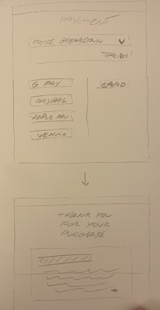
Low fidelity wireframes
Sketching low fidelity wireframes by hand is a quick and dirty way to get down my ideas without being too precious. This was the first step in visualizing these combined pages for a faster checkout experience.


Instructor feedback
My instructor suggested a lot of sizing and spacing changes as well as some feedback on user preferences and usability, especially on button and input field sizing and spacing.
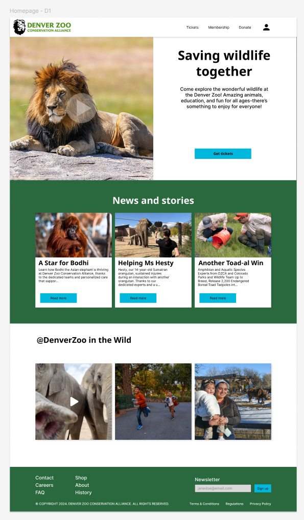
Before
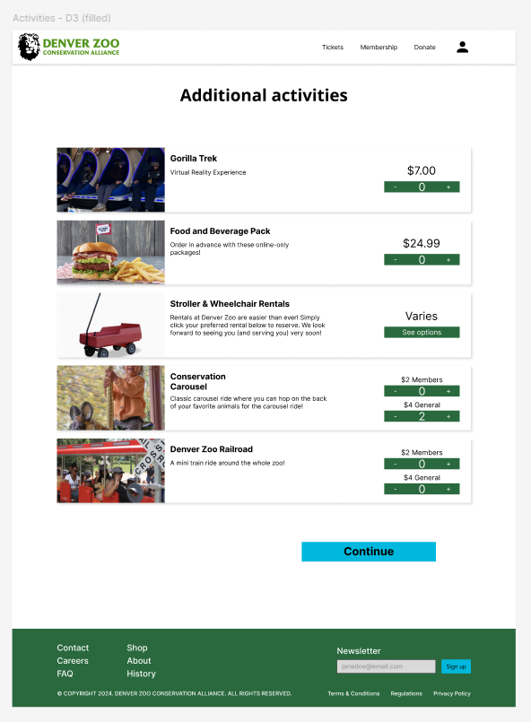
After

Evaluation and Results
User Testing Process and Pain Points
For the final round of testing, I had three users try out the high fidelity prototype. They pointed some spacing issues, color preferences, and a missing continue button.
Updates
To fix these, I fixed all the button and input field sizing and spacing issues, made sure it was clear which buttons were primary vs secondary, and added any missing content for site flow.
Reflection
Future Plans
If I had more time, I’d dive deeper into the aesthetics, animations, and make it fully interactive. I think there is a lot of room to make this feel more like the current branding of the Denver Zoo.
Conclusion
This project taught me a lot about the value of user feedback and how small design tweaks can make a big difference. This was also my first time using Figma for website design and I’m much more confident with the software now. I’m happy with the redesign and how it could make the Denver Zoo website a lot more welcoming and useful for visitors.